Keith Holland and Associates Brand
Background:
Keith Holland & Associates is an optometric practice. As well as providing routine eye care for all ages, the practice specialises in behavioural optometry for children, vision therapy and sports vision.
Their logo was dated and needed to reflect the practices’ ongoing investment in technology and their existing client base.
Objectives:
To create a modern professional image that reflects the practices’ ethos.
Actions:
apt evaluated the clients business through several fact finding sessions at the client’s offices and determined the marketing strategy and brand direction for the business.
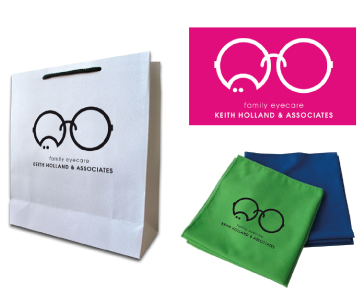
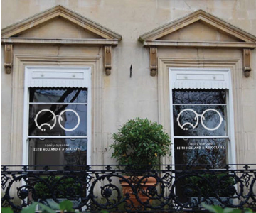
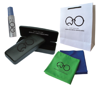
The brand was designed to look both professional and contemporary, while maintaining a friendly family appeal. The website and business stationery was brought inline with the new brand positioning.
Results:
The new brand was positively received by both staff and customers